Unit testing CSS and responsive design
Published: 2014-06-27 by Lars testingUI
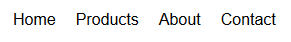
With all the different screen sizes on different types of devices the idea of responsive design has emerged. For example, responsive design allows us to display a menu horizontally when the screen is wide enough, like this:
and vertically when the screen is too narrow, like this:

Responsive design like this is typically accomplished with media queries in CSS, where we can provide different rules depending on characteristics of the device. It can look something like this:
@media (min-width: 401px) {
    .menu li {
        float: left;
        padding: 0 10px;
    }
}

@media (max-width: 400px) {
    .menu li {
        float: none;
        width: 100%;
    }
}
How do we write a unit test to verify that our CSS has the correct behavior on different devices?
One way to do it, is to create an HTML fixture in our unit test with an iframe where we inject our CSS and some sample markup. By adjusting the size of the iframe we can assert on the position of the menu items to verify that our responsive behavior.
Creating the iframe can look like this (using jQuery and Mocha):
beforeEach(function () {
    fixture = $('<div id="fixture"></div>').appendTo('body');
    iframe = $('').appendTo(fixture); // Note: need to be in the DOM for styles to apply
    context = $(iframe.get(0).contentDocument);
    $('').text(menuCss).appendTo(context.find('head'));
    var menu = $('<ul class="menu"><li>Item 1</li><li>Item 2</li></ul>').appendTo(context.find('body'));
    items = menu.find('li');
});
Then we can verify that the menu renders horizontally if the view port is wide enough:
it('should turn horizontal when wide', function () {
    // when
    iframe.attr('width', '401px');

    // then
    expect(items.eq(0).offset().left).to.be.below(items.eq(1).offset().left);
    expect(items.eq(0).offset().top).to.equal(items.eq(1).offset().top);
});
And also verify that the menu renders vertically if the view port is too narrow:
it('should turn vertical when narrow', function () {
    // when
    iframe.attr('width', '400px');

    // then
    expect(items.eq(0).offset().top).to.be.below(items.eq(1).offset().top);
    expect(items.eq(0).offset().left).to.equal(items.eq(1).offset().left);
});
A full project demonstrating this technique is available on GitHub.